Grey’s supposed to be boring, right?
Not pewter grey.
It’s not the cold grey of wet cement. It’s not the gloomy grey of storm clouds. It’s… well, complicated.
You’ve seen it before. Maybe in someone’s living room. Maybe on a cabinet in a design magazine. You thought, “Is that grey? Or beige? Or taupe? Or… what?”
Let’s clear that up.
This is a color story. A tricky one. A warm one. A grey, but not just grey.
This is pewter grey.
What Is Pewter Grey Anyway?
Let’s start there.
Pewter grey is a color that doesn’t like labels. On paper, yeah, it’s grey. But in real life? It morphs.
Some days it’s soft and cozy. Other days, moody and bold. Sometimes, weirdly neutral. Sometimes, kind of dramatic. One room, one color, ten personalities.
That’s a pewter grey color.
It’s warm. That’s the main thing. Not icy like some greys. Not bluish like others. It’s got this earthy, grounded tone. Sometimes it leans brown. Sometimes a bit olive. Sometimes even a dusty taupe.
But at its core? Still grey.
Just with flavor.
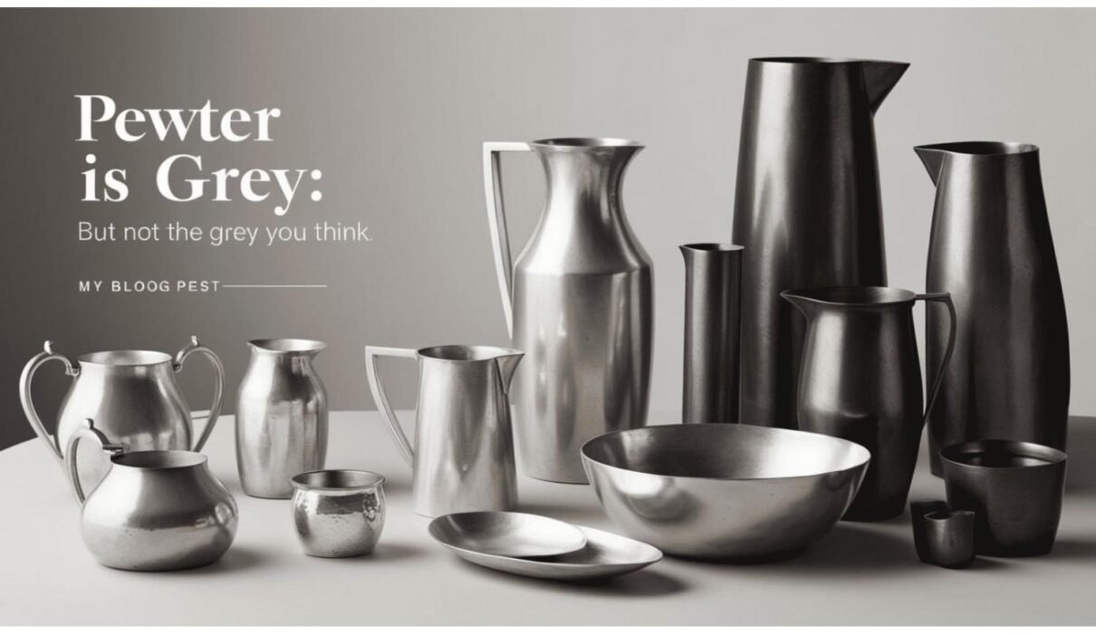
The Metal That Started It All
Before pewter was a paint chip, it was a metal.
Old-school metal. Like candlesticks tankards and colonial lamps. Tin mixed with copper and antimony. That’s pewter.
It’s got a dull luster. Not silver-shiny. Not gold-rich. Just… quiet. Mellow. Handsome.
So when designers talk about grey pewter color, they’re channeling that look. That aged, antique feel. That history.
The name comes from something real. That’s what makes it special.
Grey vs Pewter Grey: Not The Same
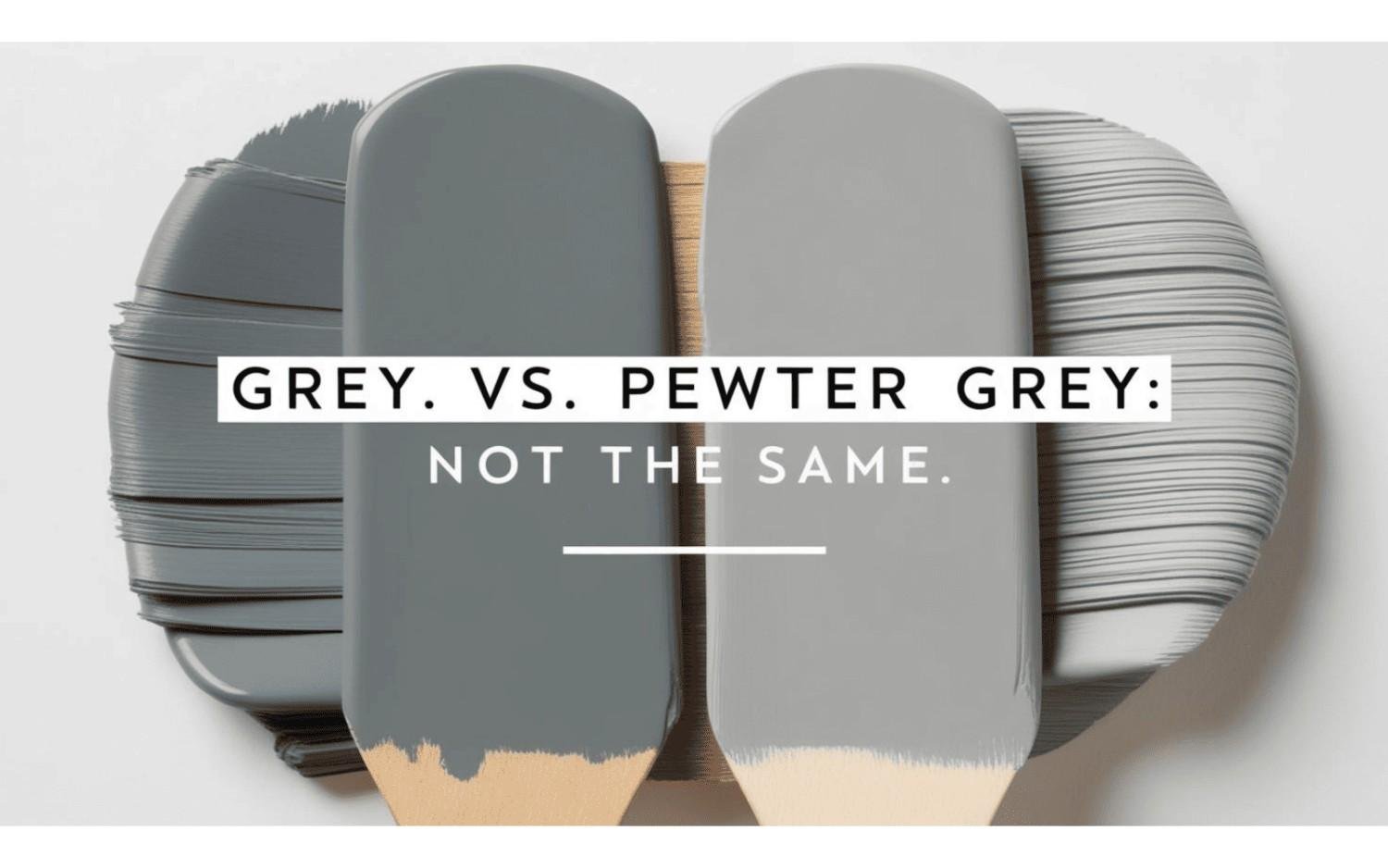
Grey is clean. Cool. Sometimes flat.
Pewter grey is cozy. Nuanced. It’s got undertones that shift in the light. Brown. Beige. A hint of green if you squint.
Do you paint a wall grey? You get grey.
You paint it pewter grey? You get the mood.
That’s why it’s showing up everywhere. Because it ain’t basic.
Real-Life Pewter Grey Moments
Let me tell you a story.
So I was redoing my kitchen. Like a full-on Pinterest board, vision mood board, call-my-best-friend-every-five-minutes kind of project.
I chose cabinets in “light pewter grey.”
Thought I was being safe.
Then the sunlight hit them at 2 p.m.
Boom—soft taupe.
The next day, cloudy skies. They looked straight grey.
Dinner time under warm lights? They leaned beige.
Same cabinets. Same paint. Multiple personalities.
That’s the pewter grey color magic. It changes. It reacts. It lives in space.
Why People Love Pewter Grey
Here’s why it’s everywhere now:
- It’s neutral but not boring.
- It goes with warm AND cool tones.
- It hides dirt better than white.
- It plays well with natural wood.
- It feels timeless.
People are tired of stark greys. Cold greys. Clinical greys.
Pewter grey? It hugs the room.
Famous Shades of Pewter Grey
Let’s talk paint. The kind you find in the real world.
1. Benjamin Moore’s Grey Pewter (N63 Pewter)
An icon. Seriously.
Benjamin Moore’s grey pewter, also known as n63 pewter, is one of those paints you can use anywhere. Bedroom? Check. Living room? Gorgeous. Cabinets? Chef’s kiss.
It’s that warm mid-tone grey that somehow feels soft and grounded. Not too light. Not too dark. Just right.
It has brown undertones. But it still reads grey.
Trust me, it’s worth a test swatch.
2. Light Pewter Grey
Softer. Airier.
This one’s lighter (duh), but still with that warmth. It’s a go-to for spaces where you want calm. It reflects light beautifully and doesn’t feel sterile.
Think living rooms. Entryways. Cozy bedrooms.
A little whisper of grey with a warm hug.
3. Revere Pewter Grey Paint
Probably one of the most famous grey paints in the design world.
Revere pewter grey paint is like that one pair of jeans that goes with everything. It’s grey. It’s beige. It’s neutral. But it ain’t boring.
This one’s especially popular in open-concept homes. Because it works with almost any adjacent color.
It’s technically a greige… but really, it belongs to the pewter grey family too.
Pewter Grey in Action: Where to Use It
So, where should you use pewter grey?
Walls
Perfect for living spaces. It gives you color without being loud.
Cabinetry
Kitchen cabinets in pewter grey color = heaven. Soft contrast to white countertops. Warmth without heaviness.
Furniture
Think linen sofas. Velvet headboards. Wood dressers painted in grey pewter color.
Bathrooms
Pewter grey on the walls, white tile, gold fixtures? So elegant. So chill.
Exterior
Even outside, this shade slaps. Soft and classic. Great with brick or white trim.
Design Tips with Pewter Grey
Wanna try it? Here’s how to make it sing:
Test it in different lights
Natural light. Warm bulbs. Cool LEDs. You gotta see how it shifts.Pair it with white trim
It’ll pop. That crisp contrast makes the pewter look rich.Add texture
Woven rugs. Velvet cushions. Woodgrain. Pewter grey loves texture.Mix metals
Don’t be shy. Brass, black, silver—it all works. Pewter is friendly.Bring in plants
Greenery brings pewter grey to life. It balances those earthy tones.
When Pewter Grey Might Not Work
Okay, honesty time.
Pewter grey can fall flat if:
- The room’s too dark
- There’s no contract
- You use it with other muddy tones
It needs balance.
Put it with crisp whites. Deep blues. Natural light. Let it breathe.
Otherwise? It might feel heavy.
Pewter Grey vs Everything Else
Let’s do a quick showdown:
Color | Undertone | Vibe |
Pewter Grey | Warm brown, olive, taupe | Soft, cozy, timeless |
Cool Grey | Blue, purple | Clean, modern, cold |
Greige | Beige + grey | Neutral, versatile |
Taupe | Brown + grey | Earthy, grounded |
Beige | Yellow-ish | Classic, sometimes flat |
Pewter grey wins for warmth + style.
Lighting: The Game-Changer
This needs its section. Because pewter grey is all about the lighting.
Natural light? You’ll see its warm undertones.
Cool artificial light? It might lean more grey.
Warm bulbs? It can pick up the brown.
This is why swatches matter. Like, a lot.
Tape them up. Look at them morning to night. Wait a few days.
Colors lie under bad light.
My Love Letter to Pewter Grey

I used to be a white-and-black kinda person.
Minimal. Clean. Simple.
Then I met Pewter Grey.
It changed my whole vibe. Suddenly my home felt like… home. Not a showroom. Not a Pinterest set. But something lived in. Calm. Intentional.
My dining room is painted in light pewter grey. The chairs? Washed oak. The table? Matte black.
It’s elegant but casual. It breathes. It feels right.
That’s what Pewter Grey does. It transforms space.
Conclusion: Pewter Is Grey, Just Better
So yeah. Pewter grey is grey. But it’s the kind of grey that shows up to the party in a linen shirt and cool boots. You notice it, even if it’s not trying to stand out.
It’s subtle. But stylish.
It blends. But also grounds.
It adapts. But doesn’t disappear.
That’s why designers love it. That’s why people keep painting their walls in it. That’s why it’s always trending without trying.
Whether you go with Benjamin Moore’s grey pewter, a soft n63 pewter, or the iconic revere pewter grey paint—you’re choosing a color that works hard and looks effortless.
Because pewter is grey… just with a little extra soul.